Currently, I’m working at Height — focusing on collaboration & task managment.
On the side I’m working on Kip , a score-keeping app for iOS.
I like to capture the world around me through photos
Gantt
Height ∙ 2022
Context
List visualizations are a core aspect of Height. They allow you to visualize tasks in various ways based on their attributes. Spreadsheet, Kanban & Calendar were the first view options available in Height, and we decided to include a Gantt option based on feedback. Users wanted a way to visualize their tasks based on date attributes, to make task planning easier.
Solution
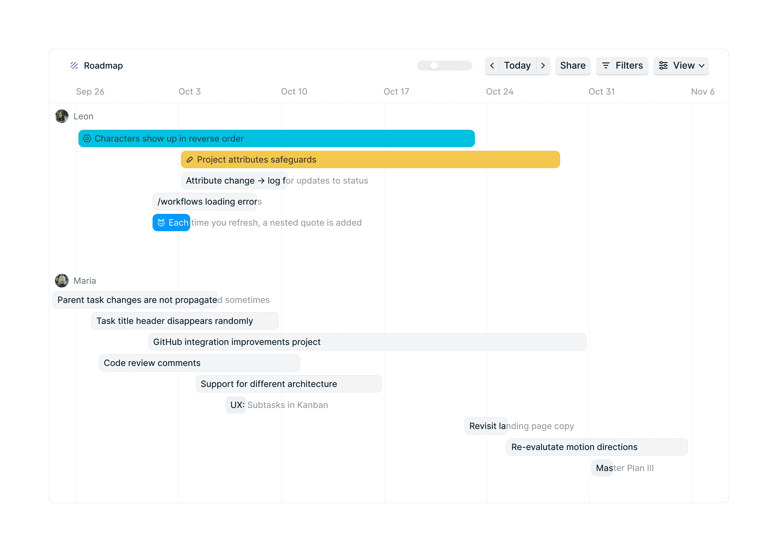
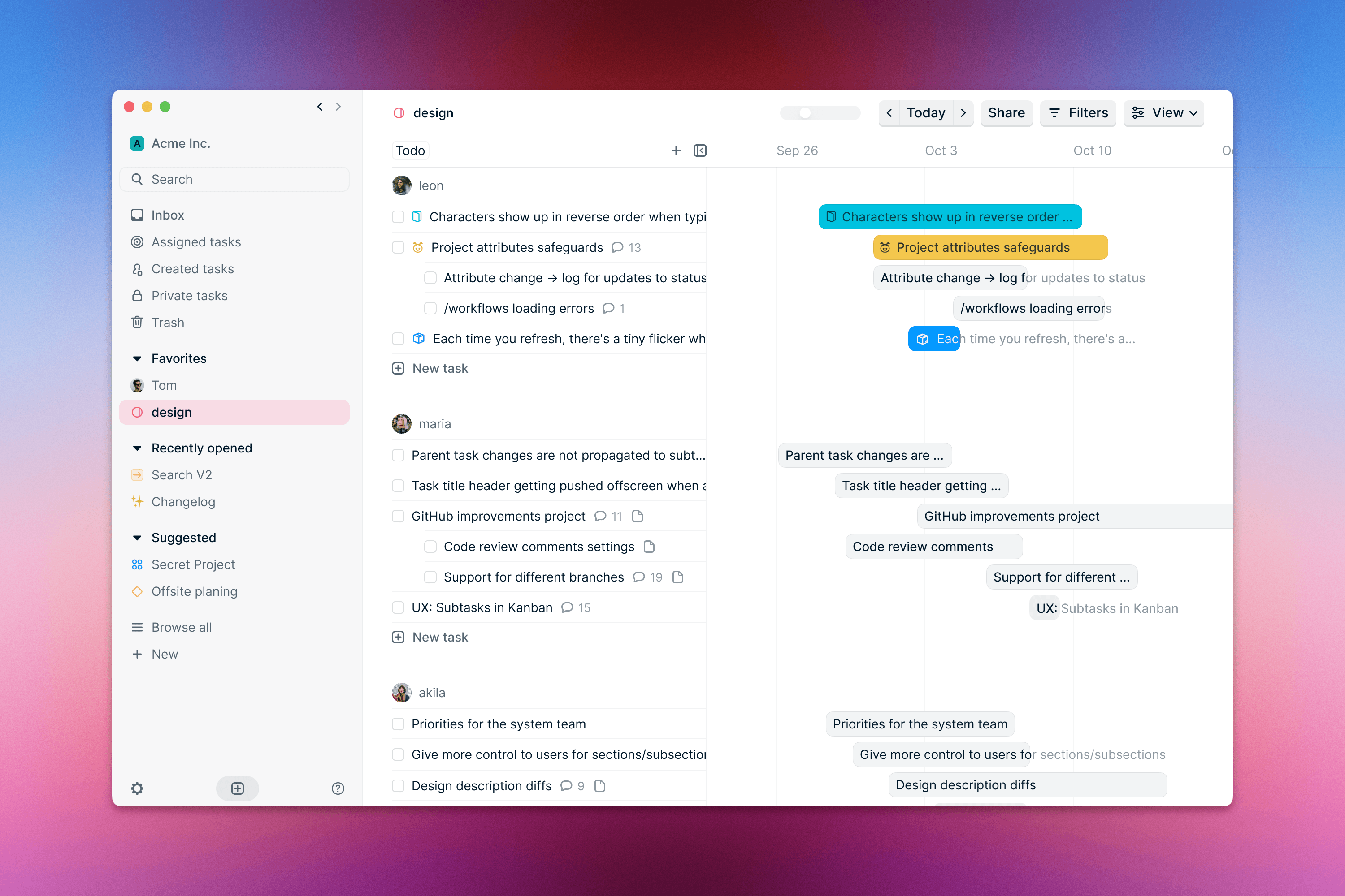
During the design process, it became clear the Gantt view had to include a 2 key elements:
An horizontal timeline
A minimal & optional spreadsheet
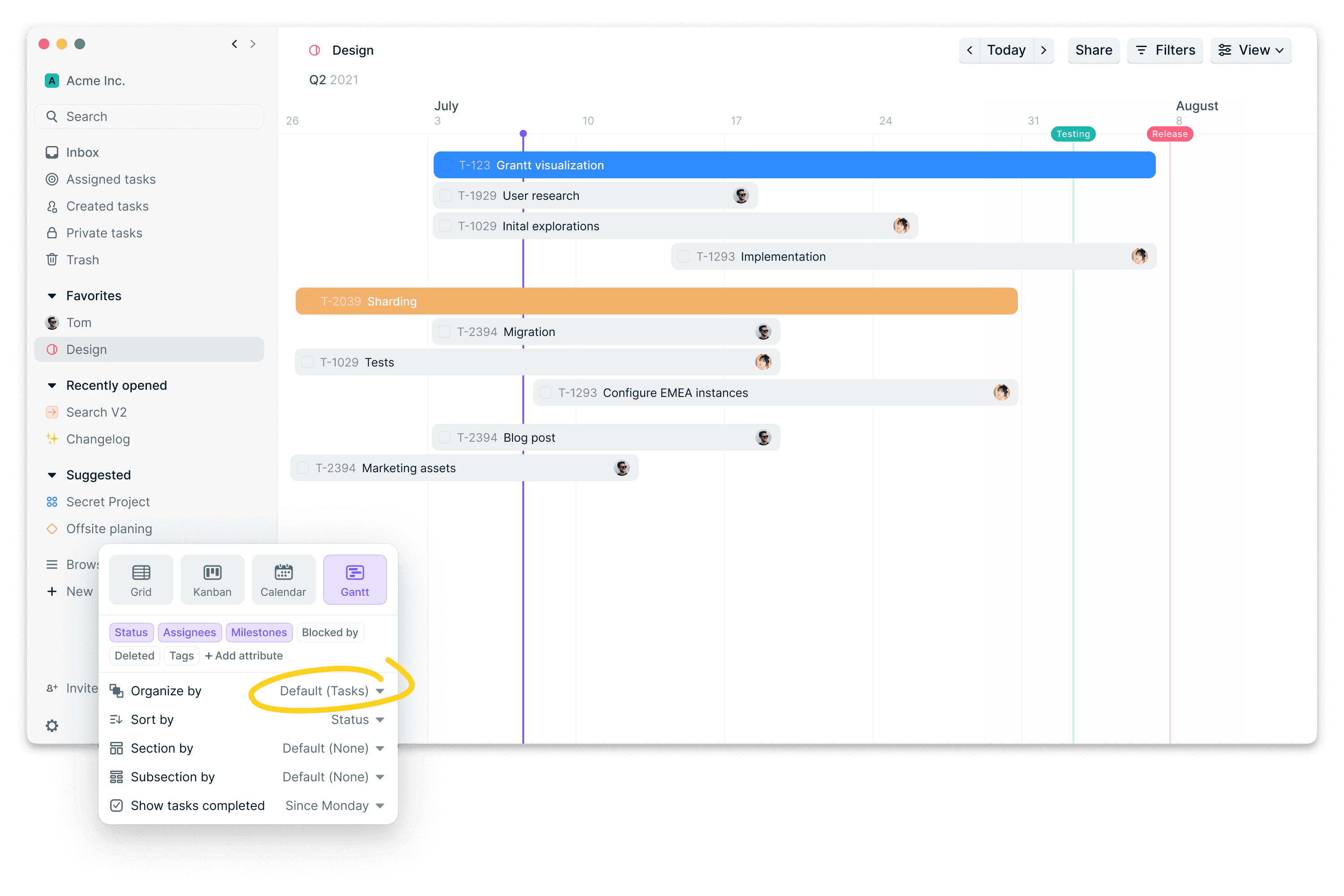
Initial designs relied mostly on the horizontal timeline for task manipulation and organization. Similarly to the spreadsheet and Kanban view, we wanted the view to appear simple, yet powerful.
After a few revisions, we decided to add a spreadsheet panel to the view. The main motivation was to maintain the same level of flexibility the spreadsheet view offered in terms of sorting, sectioning & grouping.
Other explorations
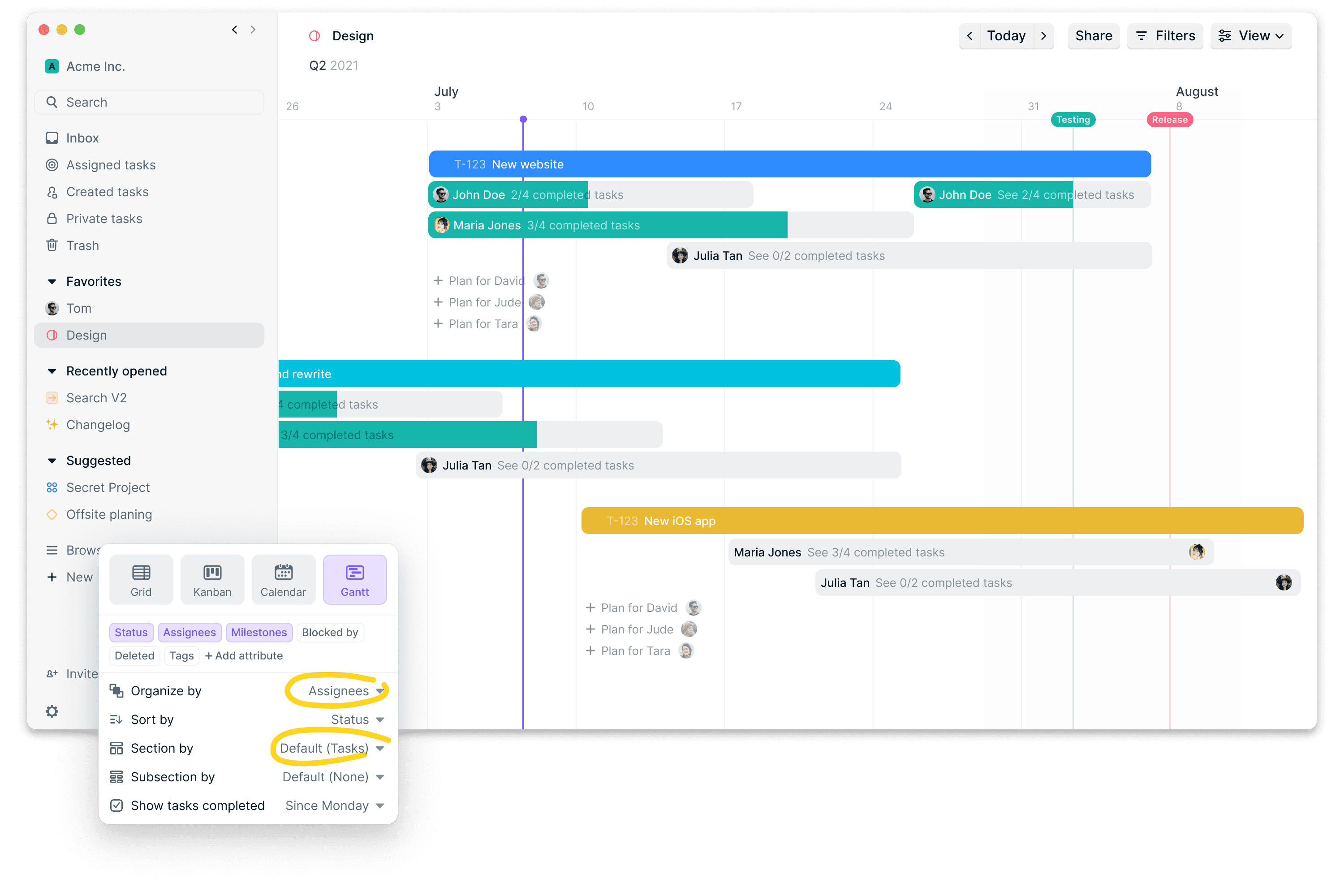
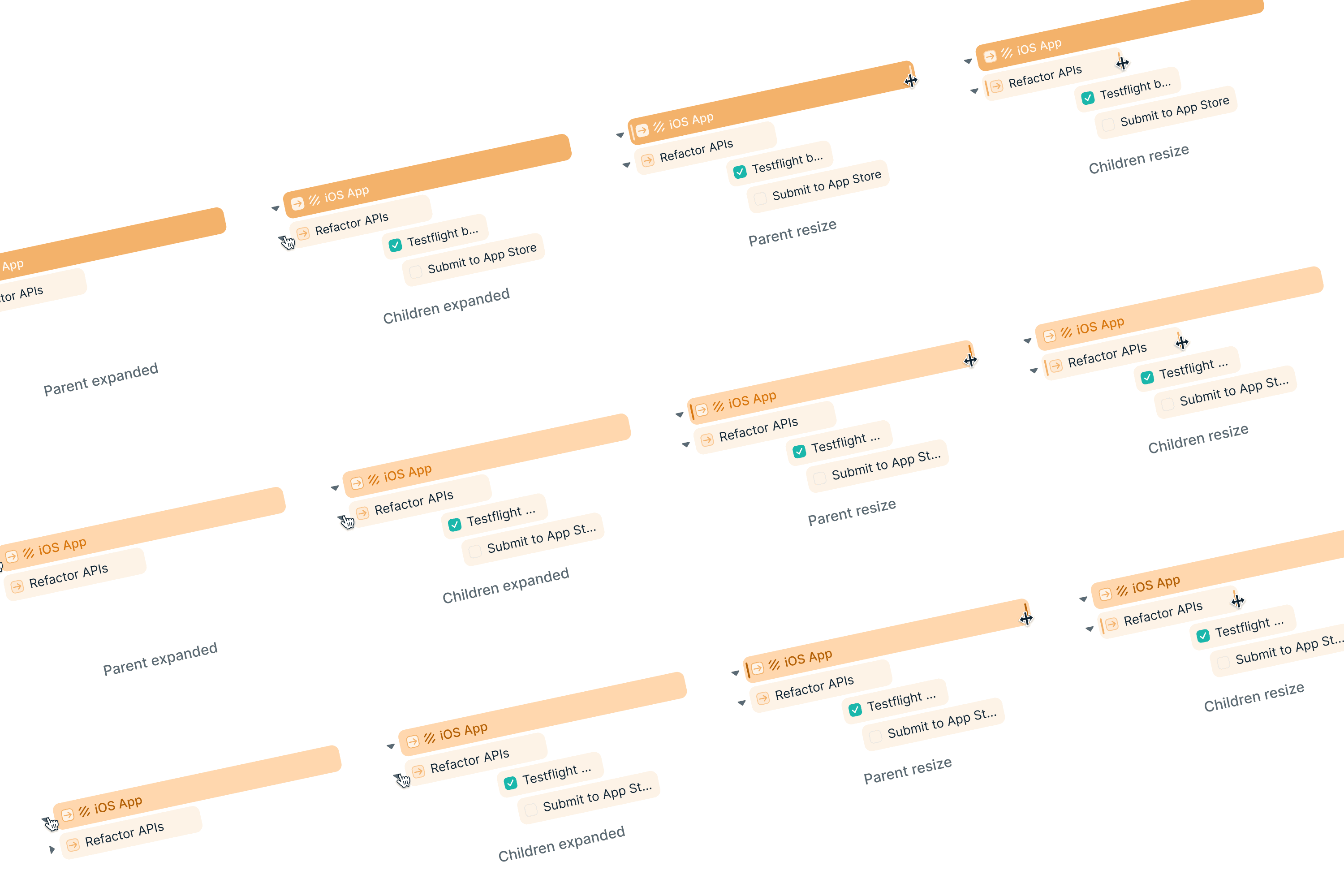
Some early explorations focused on the usage of color to better visualize parent tasks and subtasks. This lead to some improvements to our color system, specifically around contrast of colored labels on backgrounds.
A big focus at the beginning of the project was introduction of a workload concept, and being able to see progress directly from the view. Each project showed assignees and their progress based on subtasks assigned to them. This solution introduced a new “Organized by” setting which turned out to be slightly confusing.
